This page is for prints and other DIY art I made and am happy with. They are all over the place for now, not sure though if I want to sort them to more context.
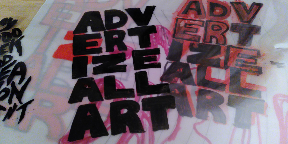
Added this piece on the below stencil for a second screen print on a t-shirt. Art needs to be advertized to everyone because mostly, mainstream audiences have no clue what art is about, or how it documents how we as a people live and what comes with society, mentality, psychology, et cetera, how all it does is try to explain instead of divide, how many of particular political spectrums try to frame it. But damn, did I struggle to finally get started with this one, although being happy with how the typography on FND004 turned out with the exact same approach but fewer worries. I really had to remind myself here that I don't want it to be perfect. The framework I had in mind for this piece was Kubrick's monolith in his 2001 movie, which has straight lines, of course. This piece here doesn't. And it doesn't need to! All it needs to do is to capture its block structure, unmoving, like a child standing with a tight fist in a rooted stance to adamantly bring my point forward. The way I managed should be fine, I believe.
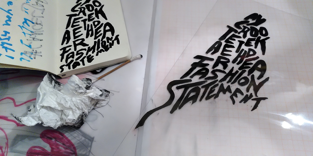
A statement on pop culture and celebrity slop and on those objectifying themselves. Yes, I'm not into veneers & vanity. Not that I see vanity as a form of illness, but to this degree it might actually be. I am thinking about screen-printing this in black on white t-shirts like the black rot that has infested their minds.
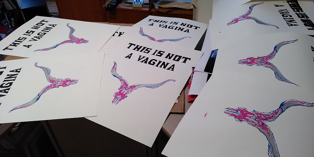
Finally, I made it! I am really happy with this last batch of five and then another 3 I made all by myself at home, kneeling on the ground. One of these is framed already and hanging on my wall. I used one that at least resembles a proper Biedermeier frame, to stay in context with where all those narrow-mindedly persistent patriarchal ideas may come from in our closer history, limiting young boys' minds to detrimental objectifying views all the way through to my own childhood and upbringing. It's all hand-drawn, of course, the not so steadfast western- or military-style typography with text inspired by René Magritte, although adding a little big twist here, and Georgia O'Keeffe's Ram's Head, which I copied using different markers, first on A3 transparency paper and then through that on four A3 stencil sheets, all from a print out smaller than the original of her 1935 'Ram's Head, White Hollyhock-Hills (Ram's Head and White Hollyhock, New Mexico)' to fit my intended A2 format for the screen print.
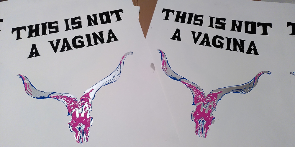
This is my first screen print. FND004 will be its catalogue number and I realized it with a little help from Andreas Diefenbach, a befriended artist who exposed the screens, showed me how to print and all the things I need and not necessarily need for it and I couldn't be more grateful! I made a batch of ten in his backyard and plan to do more at home once I have everything set up, because at first glance I wasn't too happy with the result, albeit being very happy at the second I am still curious how different they'd look if I printed all colours in their correct order, with the cyan blue last after finding out whether or not silver or magenta should go first. For these here we printed the latter last, because Andi had exposed its screen the wrong way. Hence, we had to print in two sessions and printed all we could in the first.
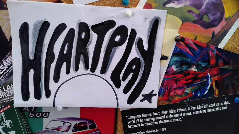
For FND003's cover print I drafted this stylized copy of the name I use as a sound artist (I'd never call myself a musician, dilettante that I am) which I later transferred to my computer in order to print it on a neighbour's plotter and heat press with a surface feel. He introduced me to some leftover pieces of flock and I decided then and there to use that and went for the colour purple. The piece of paper I placed over a record sleeve's stamped out middle hole which I marked in black to have it in OG size and used the same black paint marker for the logo and then a silver one for corrections here and there, adding a little star of course to round things up. It's weird lo-fi disco after all and it goes quite well with the old cinquecento, that Nintendo quote that never happened and those Franz Marc pieces :-D
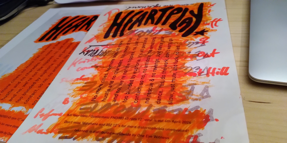
The original pieces I used for the ad below. Covered a little on the left is another draft I did which I was happy with initially, but then figured I had put too many layers of paint on the transparency's backside, making all typography a bit too dark and looking too clean overall, so I created another which I then used for the final scan.
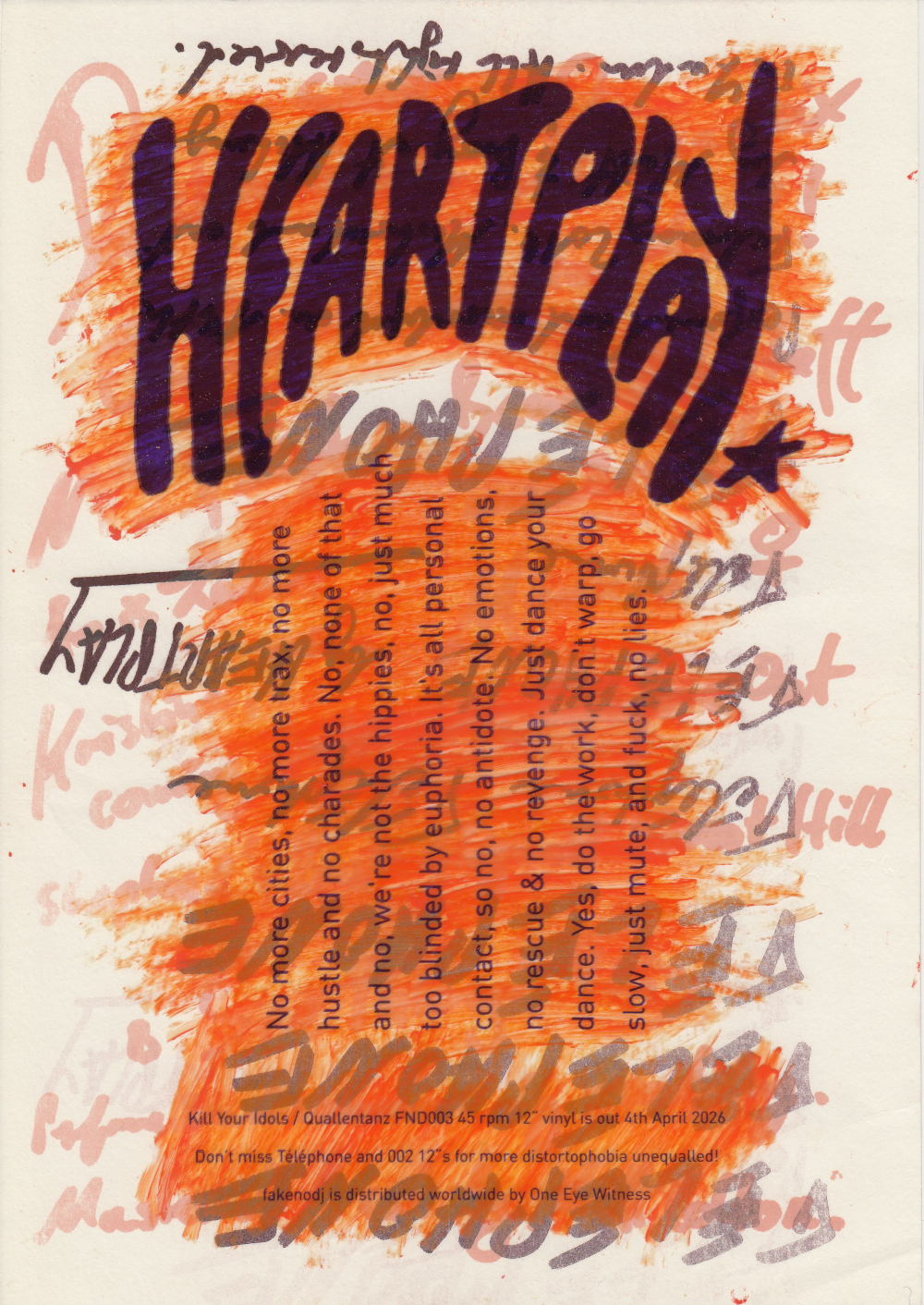
This is an ad I made for my FND003 12" release. It's the first I ever made for myself, going through the full process. It's a DIN A4 scan of double purple inkjet print for a fuzzy effect on overhead transparency, with its backside doodled in orange paint, on top of leftover RISO test prints I made for my first two 12" inserts featured farther below. I consigned this piece as a full page ad to MEANS Magazine, a wonderful DIN A5 DIY affair, where it is featured in issue no. 4, published in Q1 of 2026. Each issue of the magazine focuses on one key topic. This one's is Dissonant Laws.
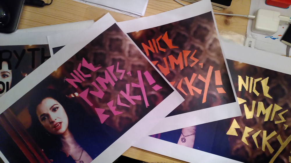
These are some filmstills which I photographed off the tv screen with my smartphone, then laser-printed them on 80g DIN A3 paper to stencil and paint-mark them. It's a mess with paint markers, but I like it anyways how the paint has its own mind and never really sticks. None for sale!
Drafts and finalized stencils for my first screen print to be realized with a little help from Andreas Diefenbach. I used the intro of a track I taped to build up tension of some sort :-)
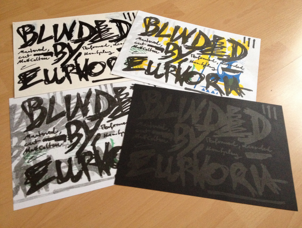
The evolution from the original piece on the upper left over two tests to the final piece of an insert I had planned to make–and have actually RISO-printed in the hundreds black on black–and add to my third 12" which I never got around to producing for too much depression at the time because my second 12" didn't sell all too well among other things–although I was very happy for having produced the record–and fear of costs being to high, only to go for the third in 2025/26 with an even much higher pricing due to various global conflicts ... anyway, I wasn't even sure what tracks exactly to put on the record, only that I wanted it to be a two-tracker, but if a Bitter Kebab mix should be on it or both, the Raw Mix and the FX Mix, or if not, which one should go with Kill Your Idols or my dark ambient drone track re-named to 'Quallentanz' just in the last minute before sending it to mastering for the actual release ten years later, I didn't know. The only thing I did know was that I'd again book Matt Colton to master & cut the record – he was still affordable at the time, but having won a Grammy, booking him is out of the question now! So this insert is a wonderful example of reckoning without one's host, of having the very essence of planning backwards, its style showing that black void we face once we realize we've been much too blinded by euphoria!
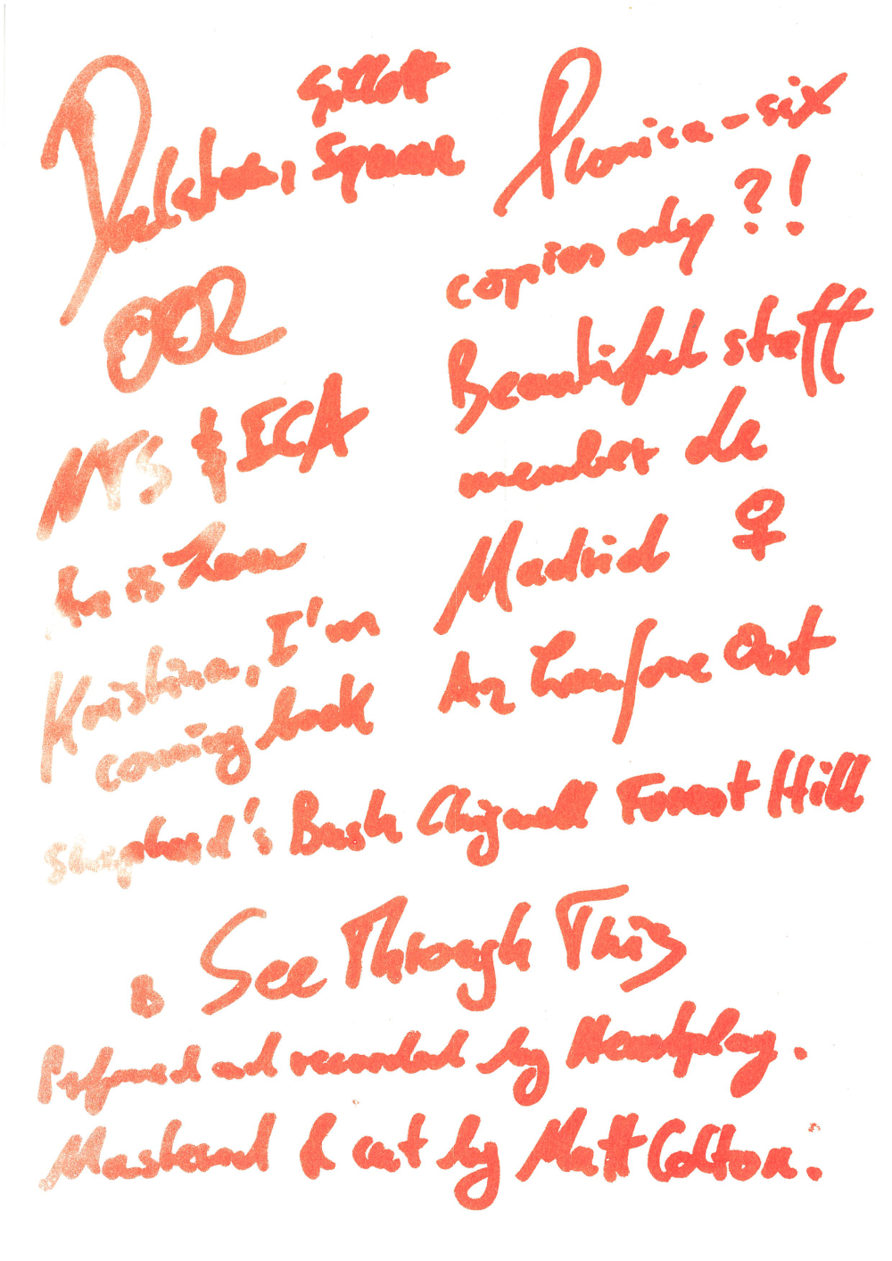
For my follow-up 12" record I made another RISO print for an insert, but this time in fluorescent orange to fully let it shine through a transparent PE cover. All copy shows key points of impressions that stuck with me after my trip to London for the tracks' mastering & cutting session at Alchemy. 10 Barb Mews.
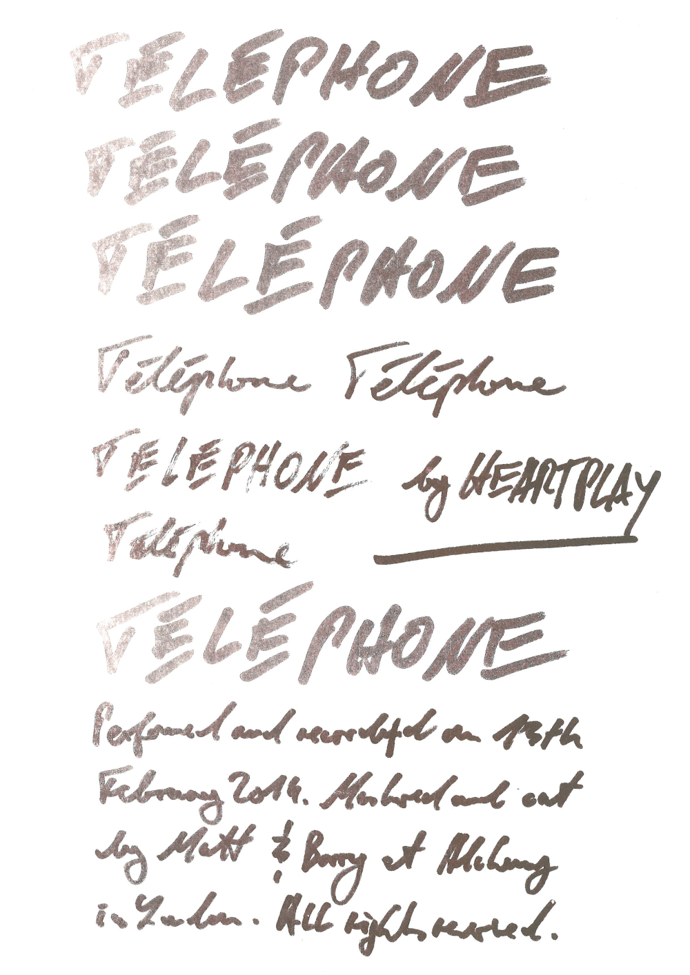
This is the first RISO print I made. Burgundy, but it was barely visible as I put them in punched-in covers as proper inserts. The printer operating person running Zweizehn liked the fact that I wrote Téléphone on it multiple times. It's so long ago that I can't tell anymore if I really did it this way because around that time someone asked me if I had made the experience of using dial-operated telephones ... yeah, well, ring ring ring :-)
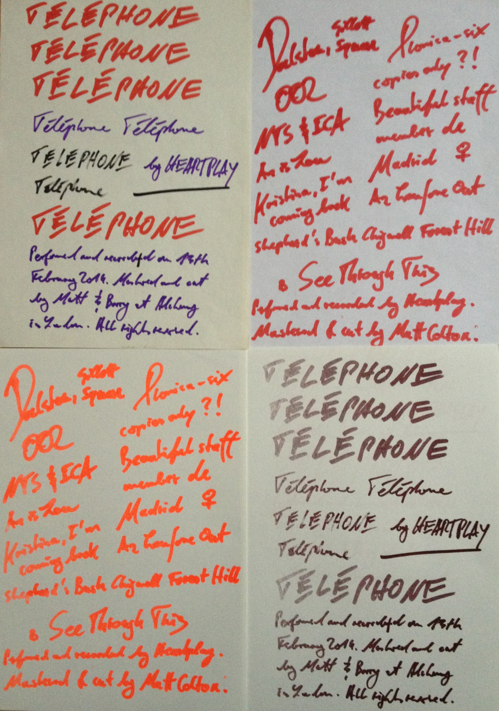
These here with the red are the original artworks I created with paint & permanent markers on DIN A4 paper, which we then RISO-printed in burgundy and fluorescent orange respectively on 120g paper, using the Mainz University of Applied Sciences Design, Department of Media Design's facilities.
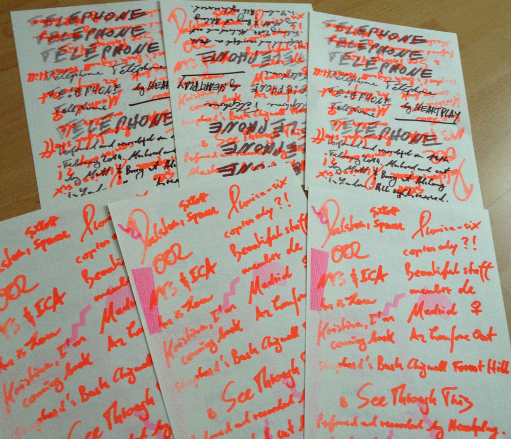
Some test prints we printed in Mainz in order to get the angles right and find out how the whole idea looked in real life in the first place. What I like most about working with a Risograph is the imperfections that come with it and how that rawness corresponds with my sound. One of the three up on top on this photo I used for my ad in MEANS Magazine #4.
Part of how it all started ... although after this came a long nothing with some djing and label work only.
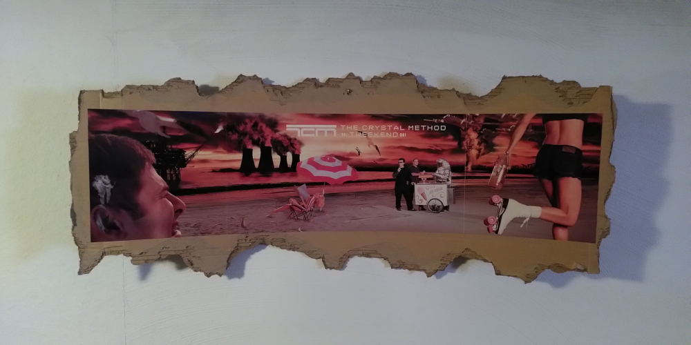
I remember working together with professional actress Helen Wernitz on a few projects during my studies and she loved to work with paper and carton. Through these collabs (I used to work the lights) is how I learned of their versatility. For a used and lived-in look she'd tear out pieces of carton before draping a whole room's walls with it, the former of which is basically what I did here for a piece of decorative art. I got this Crystal Method LP which contained this folded apocalyptic insert and on a whim one day decided to glue it to a piece of carton I had at home and just tore its sides away, because explosions, end of the world, and all that. Quite effective I think, not to say efficient in its own right.
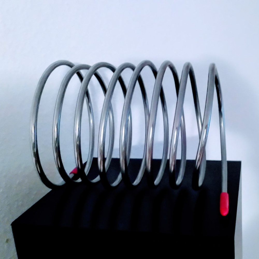
This is a piece of art I made in 1998, I believe, in 12th grade perhaps. Our project was to create applied art and I opted for a mag rack. My father and I heated up a piece of metal from our garage, bent it to its spiral form and put pieces of rubber cut from cheap pliers over both its ends.
My teacher asked what my work was with it when I showed him on the day we had to turn in our pieces. It looked as though I had bought it in a shop! That was the reason why he gave me a B+ instead of an A, this ignorant fuck!
It must have been a few days later when I went to our arts building to pick it up from the teacher’s room and one teacher of the arts major groups saw me. Wide-eyed, he asked if I did this, what grade I got for it. He stared at me in disbelief when I told him. He would have given me full points.
Art is always subjective. Always.
Home, alt text exhibition, copy, demos and mixes, film edits, Heartplay 12" self-releases, photos from OG gram, Impressum.